
Notification feature
Designing a multi-channel alert system for autonomous vertical farming robots, so operators always know when something needs their attention.
Understanding the problem
Context · Requirements · How Might We
Seasony's robots monitor vertical farms autonomously, tracking environmental sensors, camera data, computer vision signals, and robot status. But when something went wrong, operators had no reliable way to find out. The Notification Center project was born from a need to close that gap: operators must be alerted quickly and clearly, across multiple channels.
I was given the established requirements at the kick-off and used them to frame four “How Might We” questions that shaped every design decision from that point on:
- How might we reduce downtime by alerting operators to robot errors quickly?
- How might we build trust in the mobile robot solution: “I will be told if something is wrong”
- How might we provide functionality that meets the specific needs and preferences of the vertical farm?
- How might we build a foundational feature platform for further development, e.g. computer vision alerts?
Empathize & Define
Personas · Customer journey · Service blueprint
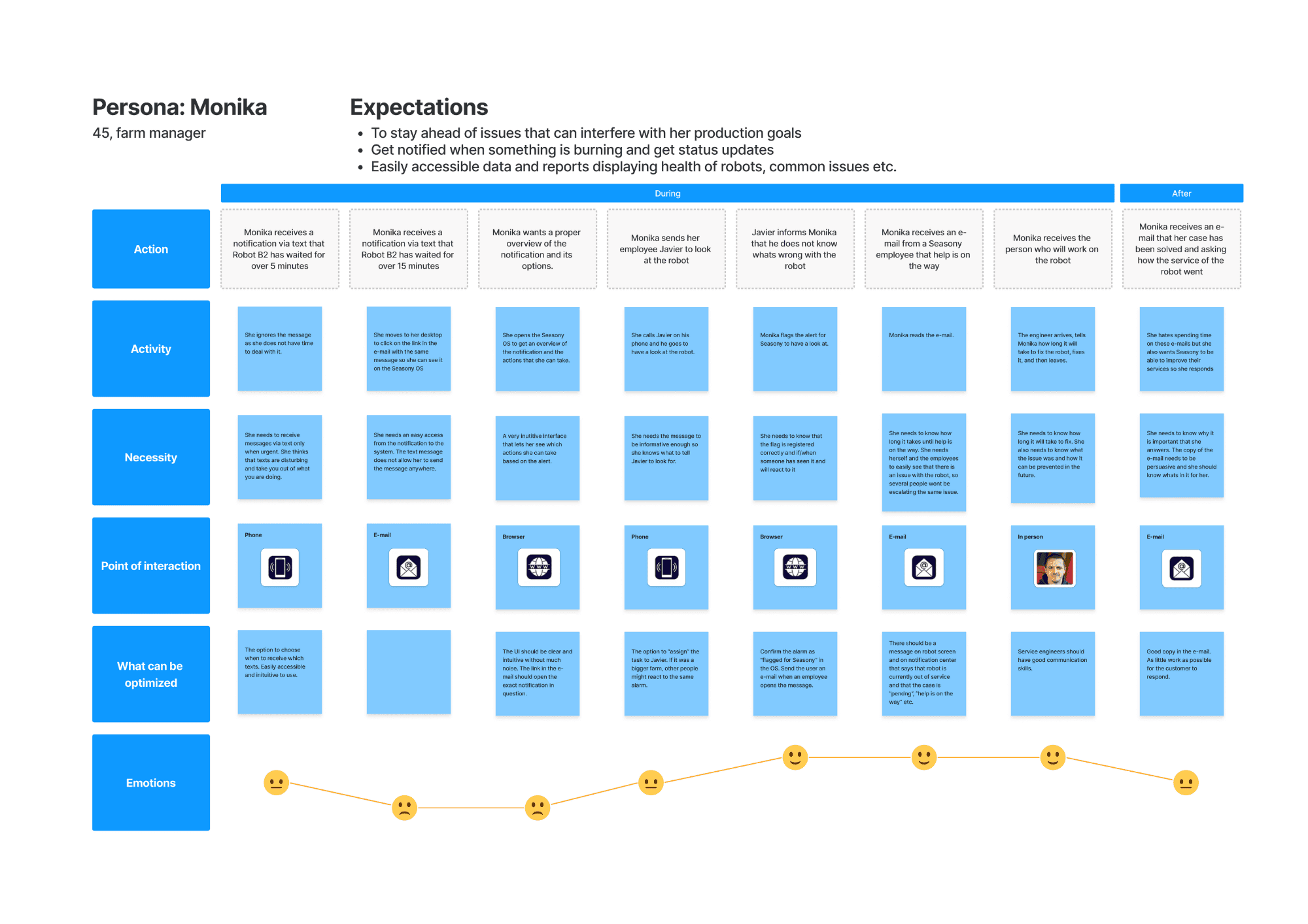
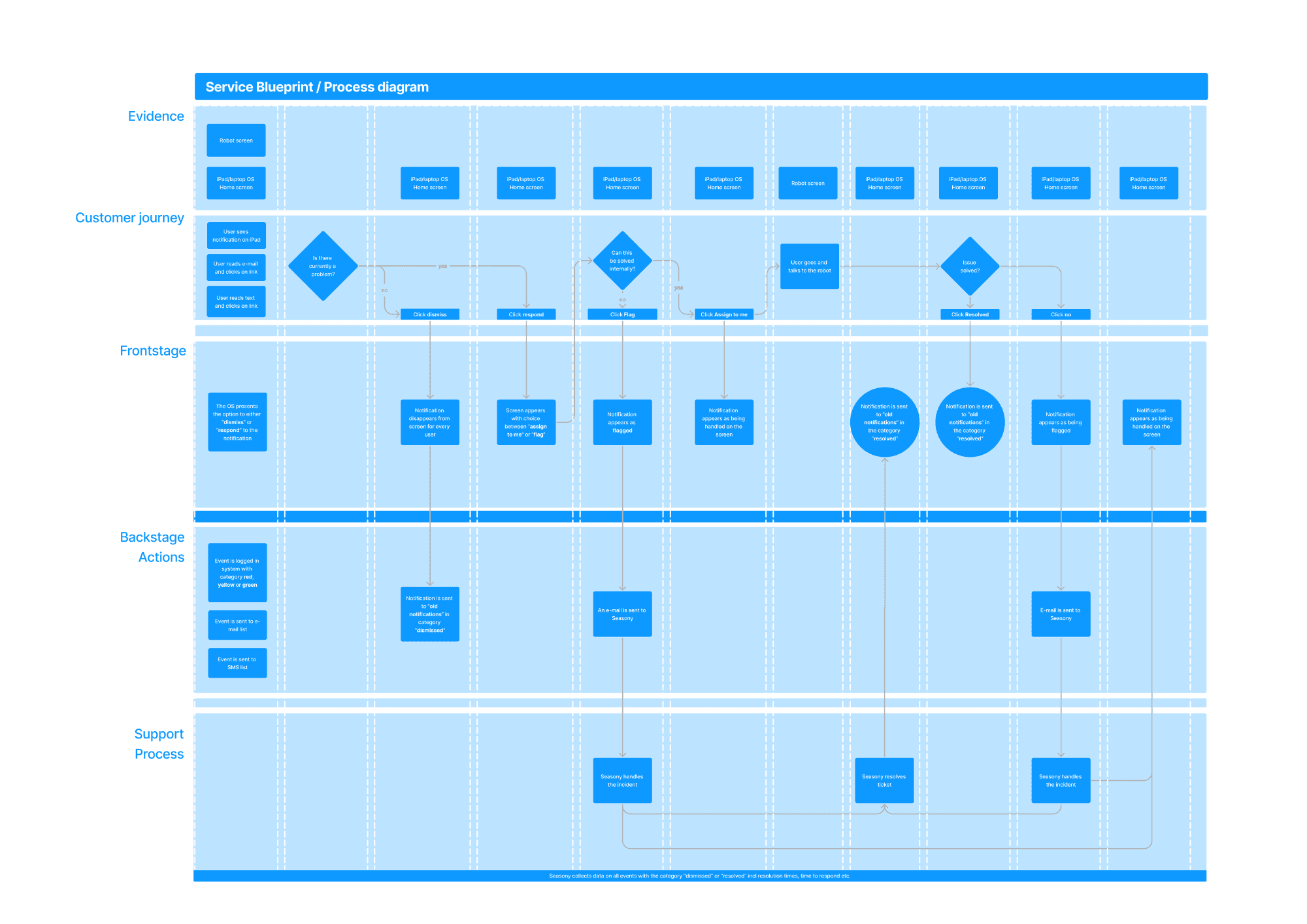
Without access to real farm operators for extensive user research, I gathered input from colleagues to build three personas representing the main actor types in the system. I then used one of these personas to construct the customer journey and a service blueprint, mapping out every touchpoint where a notification could occur or fail.
Oversees operations. Needs to decide who gets which alerts and on what channel.
Works the floor. Needs fast, clear alerts when a robot needs attention.
Pushes system-level and company notifications. Source of some alert types.
Research & Technical Discovery
Design patterns · Data flow · System architecture
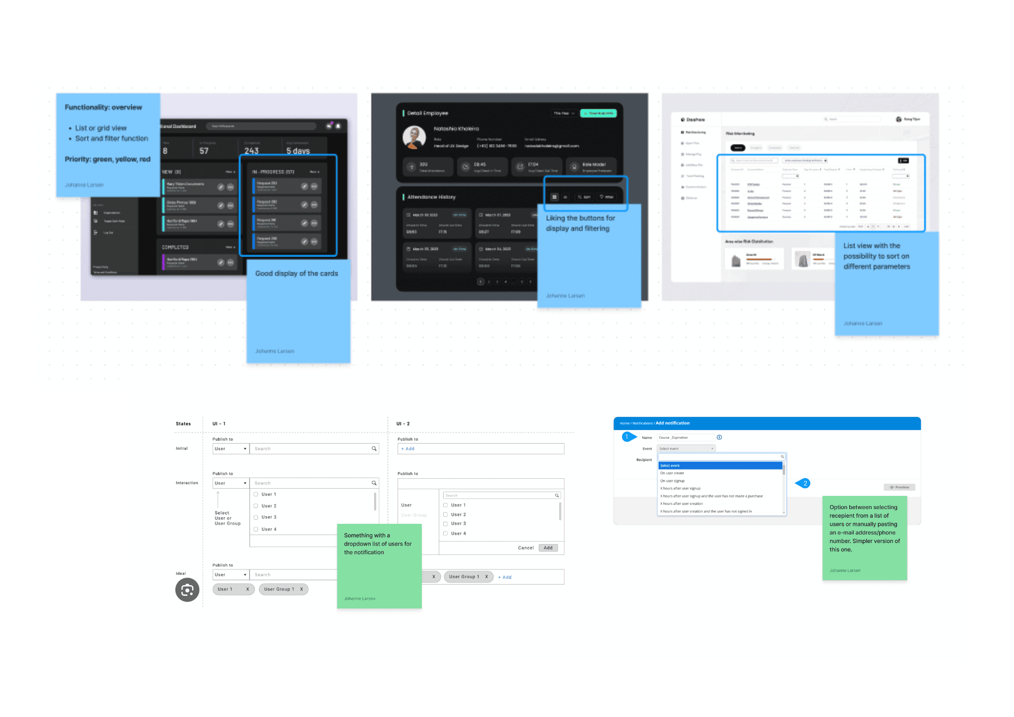
Before touching wireframes, I did two types of research in parallel. First, design and pattern research: how other systems handle notification UX, archive patterns, filter/sort conventions, and microcopy.
Second, I did technical research to understand how alerts would actually be triggered and sent. I mapped every data source: environmental sensors, camera, computer vision, robot hardware, and the OS itself, tracking whether each was active or passive monitoring. I then worked out the notification hierarchy: which events trigger alerts, and what happens downstream.
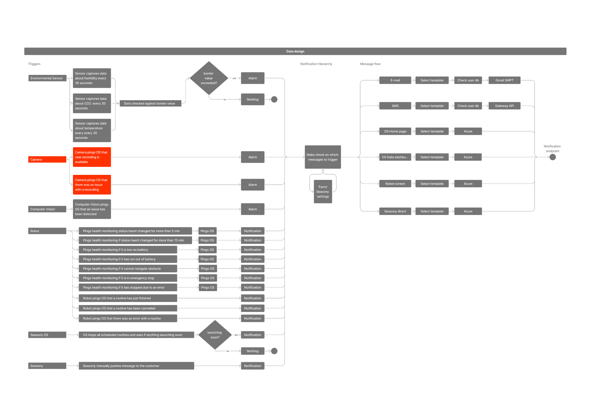
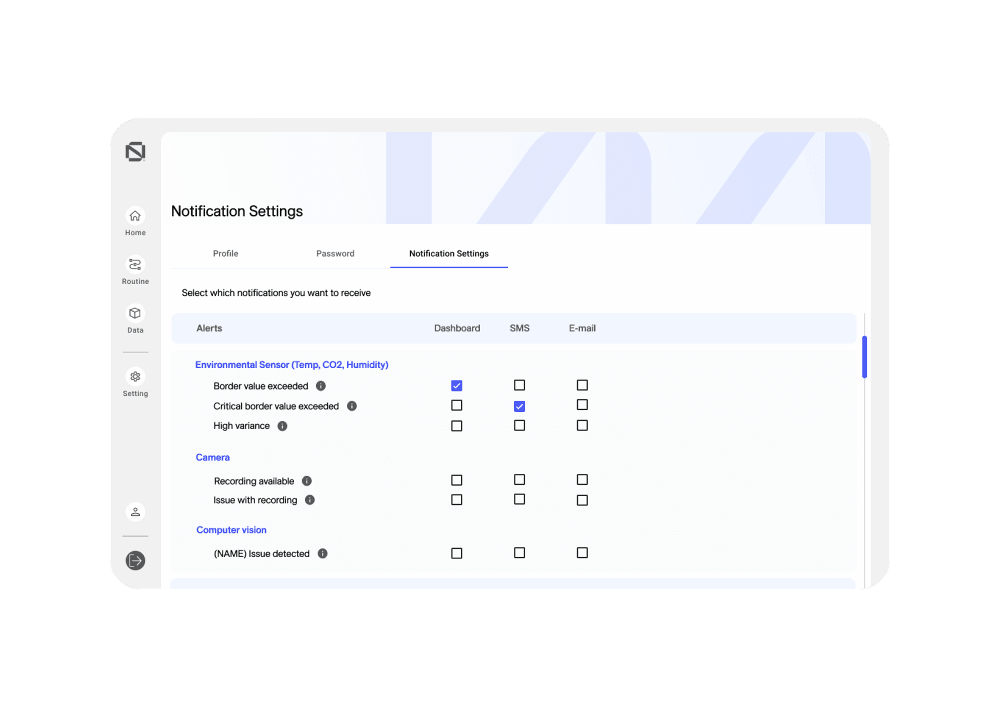
A key finding from the developer meeting: the system would ship in three versions. V1: everyone in a farm receives the same notification; one person gets email/SMS. V2: a farm manager controls who receives which alerts per channel. V3: users set their own preferences in-product. The design had to accommodate V1 while being built for V2.
Ideate
Functionality map · Roadmap · Message variations
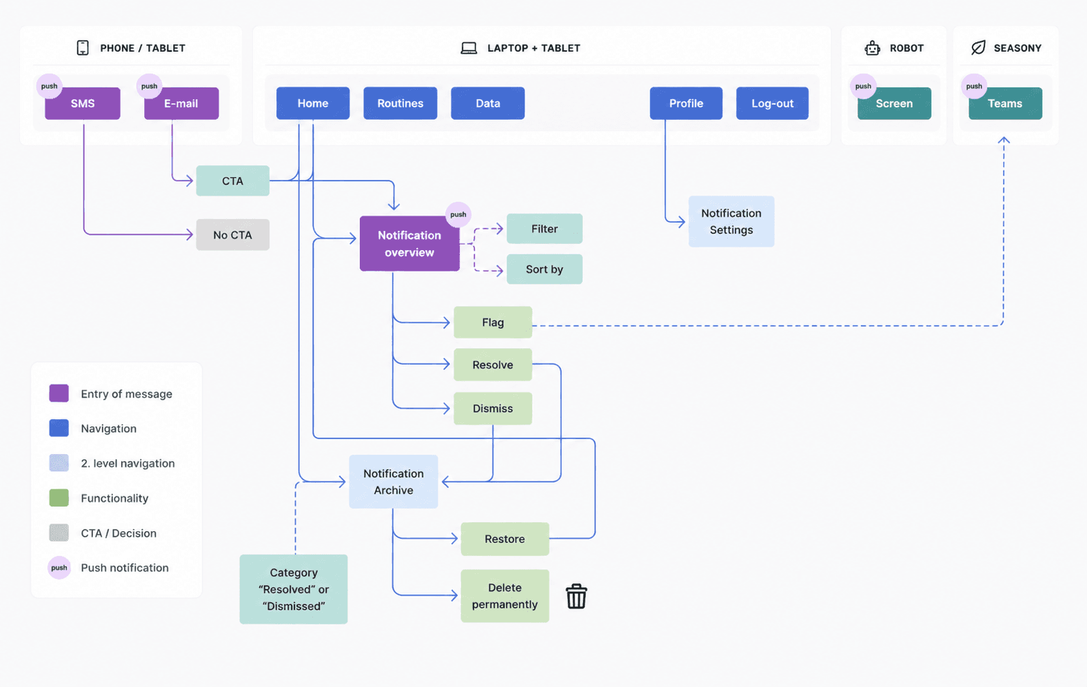
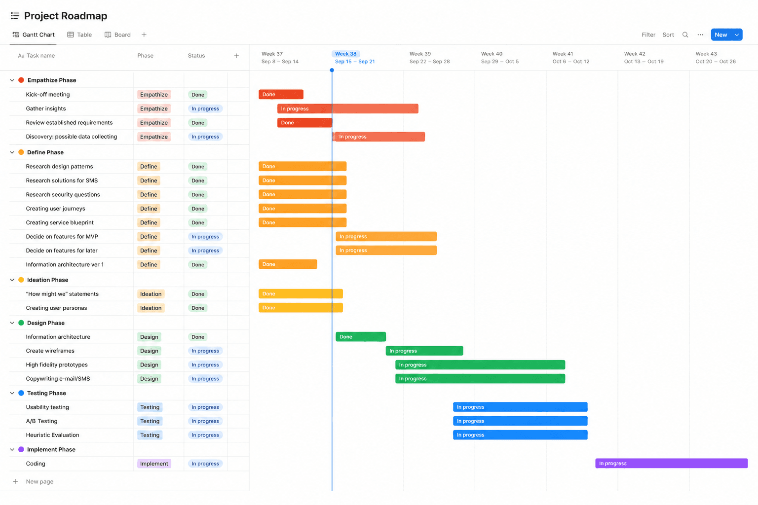
In the ideation phase I built a functionality map to ensure no required feature was missed, and created a roadmap to present at the strategy meeting, helping the team prioritize what to build first.
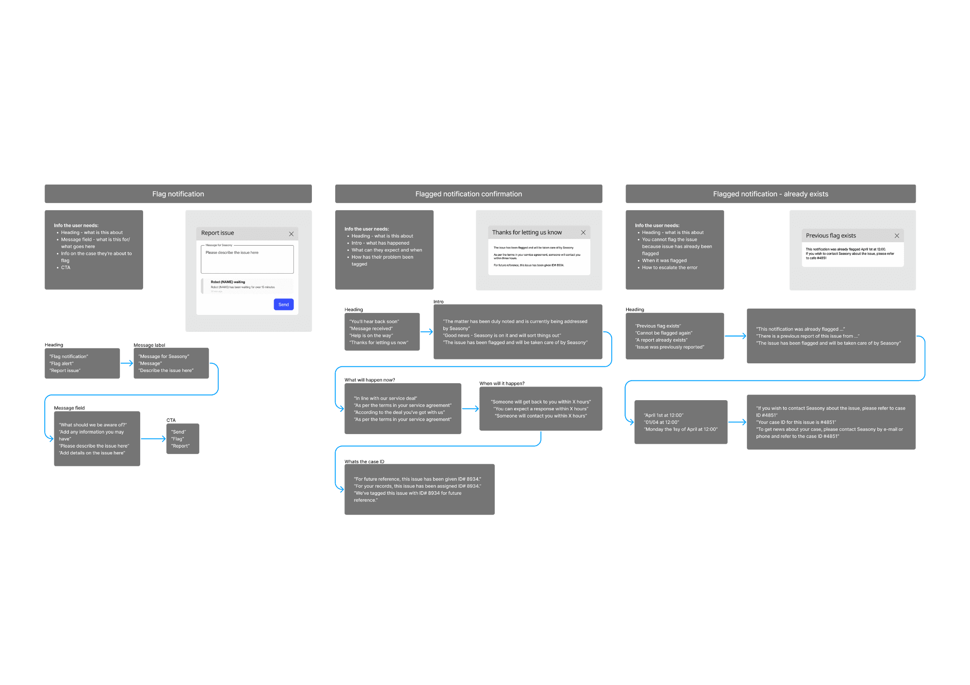
I also drafted every possible message combination across all notification types, then wrote UX copy templates for each: one version for the OS interface, one for email, one for SMS. These were structured and handed to the web developer with an indexed document for easy reference.
Wireframes & Prototype
Lo-fi wireframes · A/B testing · Interactive prototype
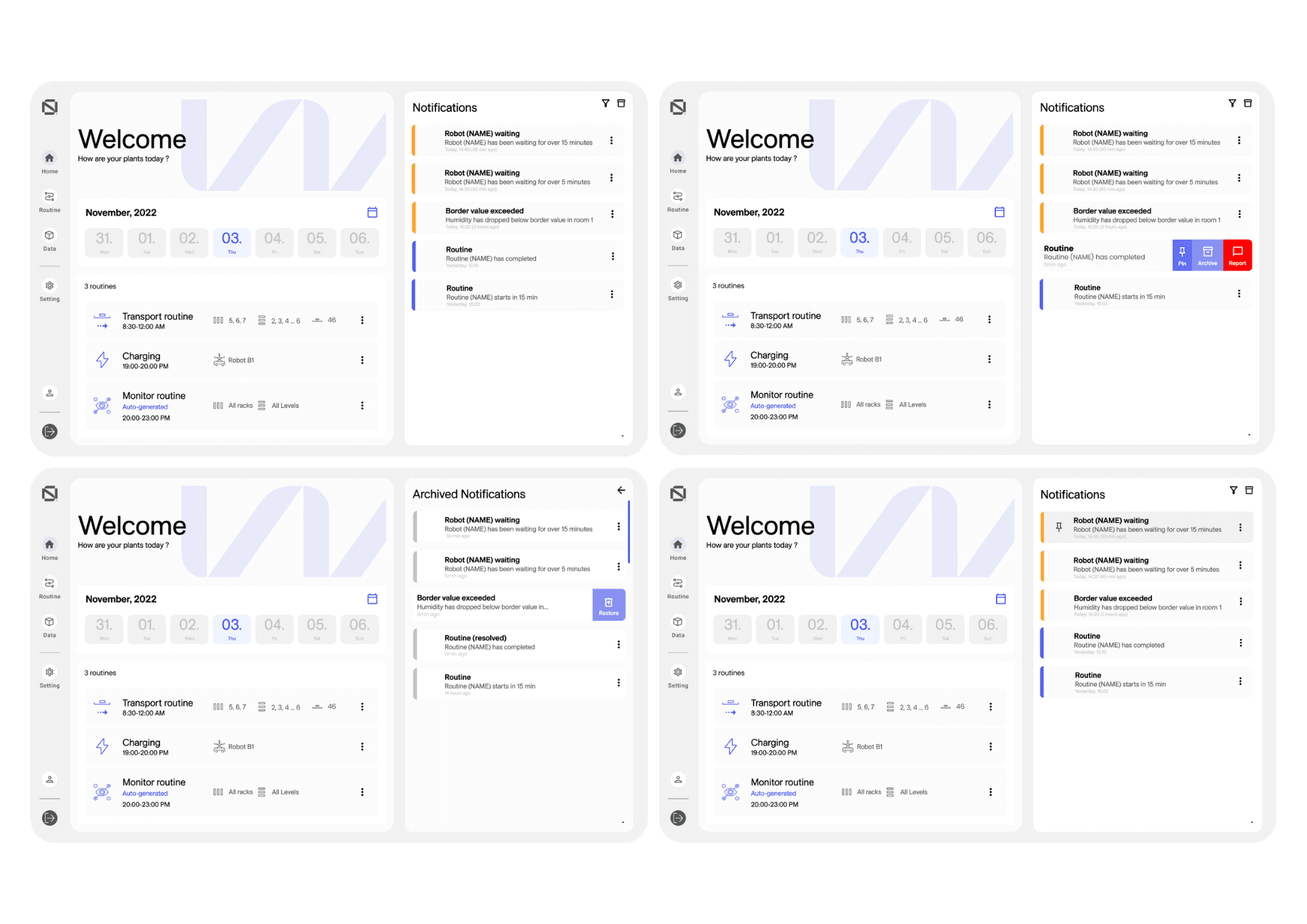
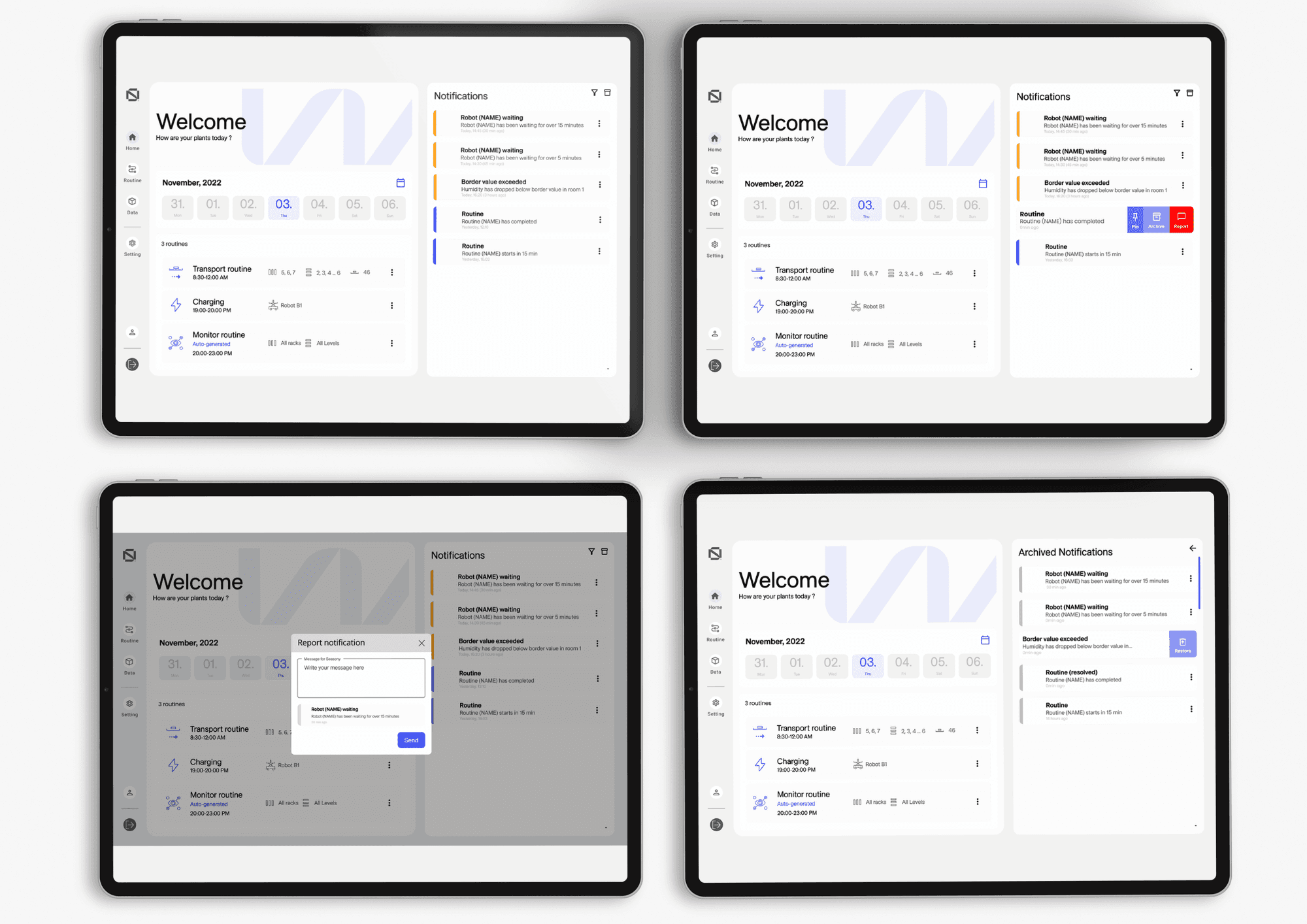
With all the research in place, I moved into Figma to wireframe the interface. The main screens covered: the notification inbox, filter and sort controls, archived notifications, and the notification detail view.
Several design decisions were tested with A/B methods. One key test: what icon should represent “go back to the main notifications view” from the archive? Five options were tested with colleagues and UX designers in my network.
The left arrow was the clear winner, implemented in the final prototype.
UX copy was also A/B tested: multiple versions of each notification template were circulated among colleagues and UX designers before finalizing. The result was a set of consistent, short, action-oriented messages across all three delivery channels.
Outcome
A notification system built for scale
Alerts reach operators via the OS, email (Gmail SMTP), and SMS (Gateway API). No missed events.
V1 ships with shared alerts. V2 adds per-user channel preferences. V3 lets users self-configure.
Full handover doc with indexed UX copy, prototype links, data flow map, and documented decisions.
Reflections
This was my first time leading both the UX design and project management on the same project. Managing scope changes (including the decision to remove extensive user testing) taught me that working within constraints doesn't mean lowering quality; it means being smarter about where you invest the time you have.